UPSC CSE Prelims 2011
The following pie charts show the breakup of disease categories recorded in the patients from two towns, Town A and Town B. Pie charts plot the disease categories as percentage of the total number of patients. Based on these, answer the question that follow.
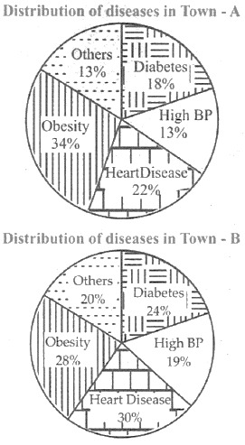
Which of the two towns has a higher number of persons with Diabetes?
EXPLANATION
Correct Option (D)
The provided pie charts illustrate the distribution of disease categories as percentages of the total number of patients within each town, Town A and Town B, respectively. To determine which town has a higher number of persons with Diabetes, it would be necessary to know the absolute total number of patients in each town. The pie charts only present proportional data, not the base figures from which these percentages are derived. Without information on the total patient population for Town A and Town B, a direct comparison of the absolute number of individuals affected by Diabetes cannot be made.
Incorrect Options:
Options A, B, and C are incorrect because they attempt to draw a definitive conclusion regarding the absolute number of persons with Diabetes in Town A or Town B, or assert parity between them. Such inferences are not supported by the given data. The pie charts provide only relative proportions (percentages) of disease categories within each town's patient population. Without the total number of patients for each town, it is impossible to calculate the actual number of individuals suffering from Diabetes in either town, thereby precluding any comparative judgment based solely on percentages.